Saturday, April 30, 2011

Designing Front Packaging- Archaic Sentiment in a Crumbling Industry

An album cover is the music industry’s equivalent of the New York Time’s front-page photography. It’s big, it’s bold, and it better be good if it is going to get anyone to sit down a take a look at the content. Besides being a marketing ploy, an album cover is also the visual expression of the musical content.

A memorable album cover can even embed the record into music history. Some very creative and rather famous examples of this are the collaged Beatles' “St. Pepper’s Lonely Hearts Club Band”, the Rolling Stones' album “Sticky Fingers” that used real zippers, and Andy Warhol’s peelable banana on the Velvet Underground and Nico’s self-titled release.

I am a music enthusiast and while albums may be supposedly declining in popularity, I still consider the cover design and liner notes to be an integral aspect of the music being released. And thus I was ecstatic when I had the opportunity to make a bid for designing one. Then I was nervously delighted when my idea was accepted.

I know that I am not Robert Mapplethorpe, nor am I Roger Dean, but I did my best to create something that reflected the sentiment of the album while still showing my artistic tendencies.

Here it is:


John Amadon’s album “Seven Stars” is the consummation of 2 years of diligent work and creative focus. I was lucky enough to hear the early versions of most of these songs and watch them develop into this final product. The sentimental lush beauty of the songs filled my ears and left me enrapt even from the first few times that I listened to the the demos.

The album is currently only available online or as a cd Digipak (a recycled cardboard & plastic combination packing). I would be holding my breathe for a Vinyl release but it’s just not going to happen.

You can listen to the album and purchase the digital version here.

You can purchase the cd or download individual songs here.


Now I know that you have already snickered and thought “put a bird on it”. However, I can assure you that I did not just slap some birds on this creative venture. The flock is flying in the shape of Pleiades and the size of each bird reflects the corresponding size of each star. And I shouldn’t need to mention this, but just in case, the rising sun is shrouded in gray clouds for a reason. It is hope being wrapped in a blanket of heavy truths. It speaks to the intent to pursue marching onwards despite whatever setbacks may occur and in spite of the dark natures that cling around us.

Friday, April 22, 2011

Urban Grind Photography Collection, March 2011


Daniella Fisher had a series of collaged photographs that incorporated her daughter’s drawings. Daniella’s photos were used as windows where one could peer into bits of her life while being immersed in her child's art.


Alicia Gordon presented a collection of large color photographs that were re-creations of Craigslist Casual Encounter postings. The photos are humorous and yet striking in composition and use of light. She is a recent graduate from Pacific Northwest College of Art


I presented a collection of black and white photographs that illustrated the stark reality of seclusion. However, it was not presented in a despairing manner, instead each photograph honored the tranquility that can be found in isolation. 

It is in these open spaces, free from the clutter and noise of everyday life, that we can hear our own thoughts unlocking.


My next show will be in Seattle, Wa. I will be exhibiting a collection of photographs at the Joe Bar Café in October 2011.

Tuesday, April 19, 2011

Balloon Tires, An Upright Seating Posture, and a Single-Speed Drivetrain.

I always thought cruisers where just clunky, heavy old things, that is until I actually took one out for a spin.


 It’s heavy sure, but there is a joy in pushing its old knobby fat tires around while listening to the rusty rattle of the aging frame. 

Now I have an old cruiser from the 50's that is one my favorite bikes for short rides around town. It is a coast to coast hardware bike that was abandoned when one of my neighbors moved. A little bit of grease and a few adjustments was all the old thing really need to be rolling again. Of course it still doesn't stop very well.


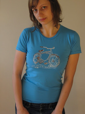
This latest shirt design is indented to pay homage to that coast to coast Crusier. This design is a collaboration with Portland based musician and illustrator Zack Barbery.

Portrait of a woman (Aramee Diethelm) in a shirt she designed and hand silkscreened

This design is available at the Workhouse in Bend, OR.

A portrait of Aramee Diethelm wearing a tshirt that she designed and silkscreened.

There also a unisex black and white t-shirt available at dieatthehelm.etsy.com.

Monday, April 18, 2011

breaking new ground

Portrait of Aramee Diethelm
This is the maiden blog-post for Die at the Helm, my arts and crafts design company. I have been hard at work in my little studio space in Portland, Oregon. This blog is meant to showcase my current projects and to share some of my inspirations.